CPB Baltics
CPB Baltics re-branding and homepage designDelivery
Technology
NCCL is a non-profit, non-governmental membership-based business association for companies with Norwegian - Latvian share capital, management or cooperation. Norway is one of the largest investors in Latvia with over 350M EUR and the Norwegian Chamber has close to 100 members. Members are invited to regular business and social events with interesting topics, speakers, companies, stakeholders and networking opportunities. NCCL facilitates professional networking, exchange of experiences, provides relevant information and promotes Norwegian companies, competence and business values.
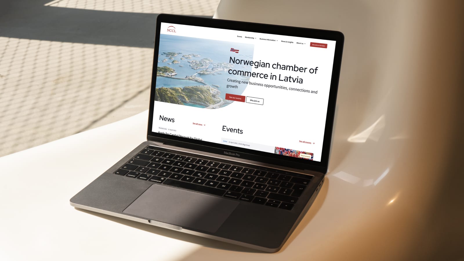
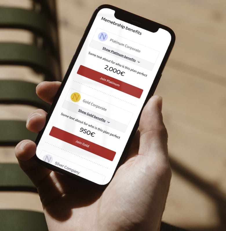
Our goal was to create a new, clear and user friendly website for new and existing chamber members. The main challenge was to optimise membership wizard for Individual and Corporate members by breaking down a huge amount of data into 3 simple and straightforward steps. All of the homepage’s content needs to be easily understood by people in many different industries. And also because people come from different backgrounds, they use different devices to visit the site so such difficult elements, like membership plan comparison tables, need to work well on all devices. On the development side it was important to automate registration to events for chamber members, because this previously was a manual and very ineffective process for the homepage content admins.
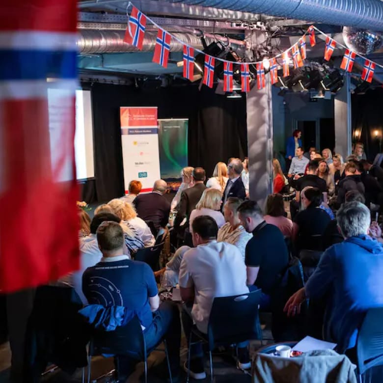
Project started from a research phase to understand what this organisation is and who the people in it are. Data was gathered through surveys, stakeholder and user interviews to better understand the needs and expectations of website’s visitors.
All of these valuable insights were a helpful tool to start brainstorming possible structure solutions in wireframes and information architecture. Wireframing phase helped the client to understand possible use cases for visitors and for developers to understand the functionality.


Design phase started from a collaborative process in our design team where three of our designers all created their vision of the homepage which were afterwards presented to the client as possible solutions. Working together in such a way ensured that we all have had a say and freedom to express different ideas. When it was decided with which version we move forward, a helpful design system was created to support the underlying design vision.
During the development phase we began by setting up our monorepo using Turborepo, enabling efficient code sharing and organisation among multiple packages and tools. Leveraging the Sanity headless CMS, we defined our content models. This allowed for real-time collaboration, content versioning, and a modular approach to content creation.
In front-end Next.js served as our React framework of choice. With its out-of-the-box optimisations and hybrid static & server rendering, we developed a high-performance, SEO-friendly website.
In terms of having a good design and dev team relationship, we needed to ensure component modularity and reusability by utilising Storybook. It provided an isolated environment to build and test individual UI components, ensuring visual consistency across the site.
Vercel played a pivotal role in our CI/CD process. With every code push, Vercel automatically built and deployed the site. Its server-less function support also empowered us with backend capabilities when needed.
The combination of these tools allowed for rapid iterations. With real-time content updates from Sanity, instant previews from Next.js, and component updates through Storybook, we ensured that stakeholder feedback was addressed promptly and efficiently.




Discover how we've helped different companies around the world. Along our journey we have learnt much and collected vast amounts of data which fuels our work moving forwards. Check out some of the case studies we've done and become our next one.

CPB Baltics
CPB Baltics re-branding and homepage design
Swedbank Latvia
dPays solution for receiving deposit money
Ramirent Norway
Simplified online rental solution for Ramirent Norway.jpg?width=6399&quality=high)
Norwegian Chamber of Commerce
Revitalizing NCCL's Digital Presence: A Seamless User Experience for Members Across Industries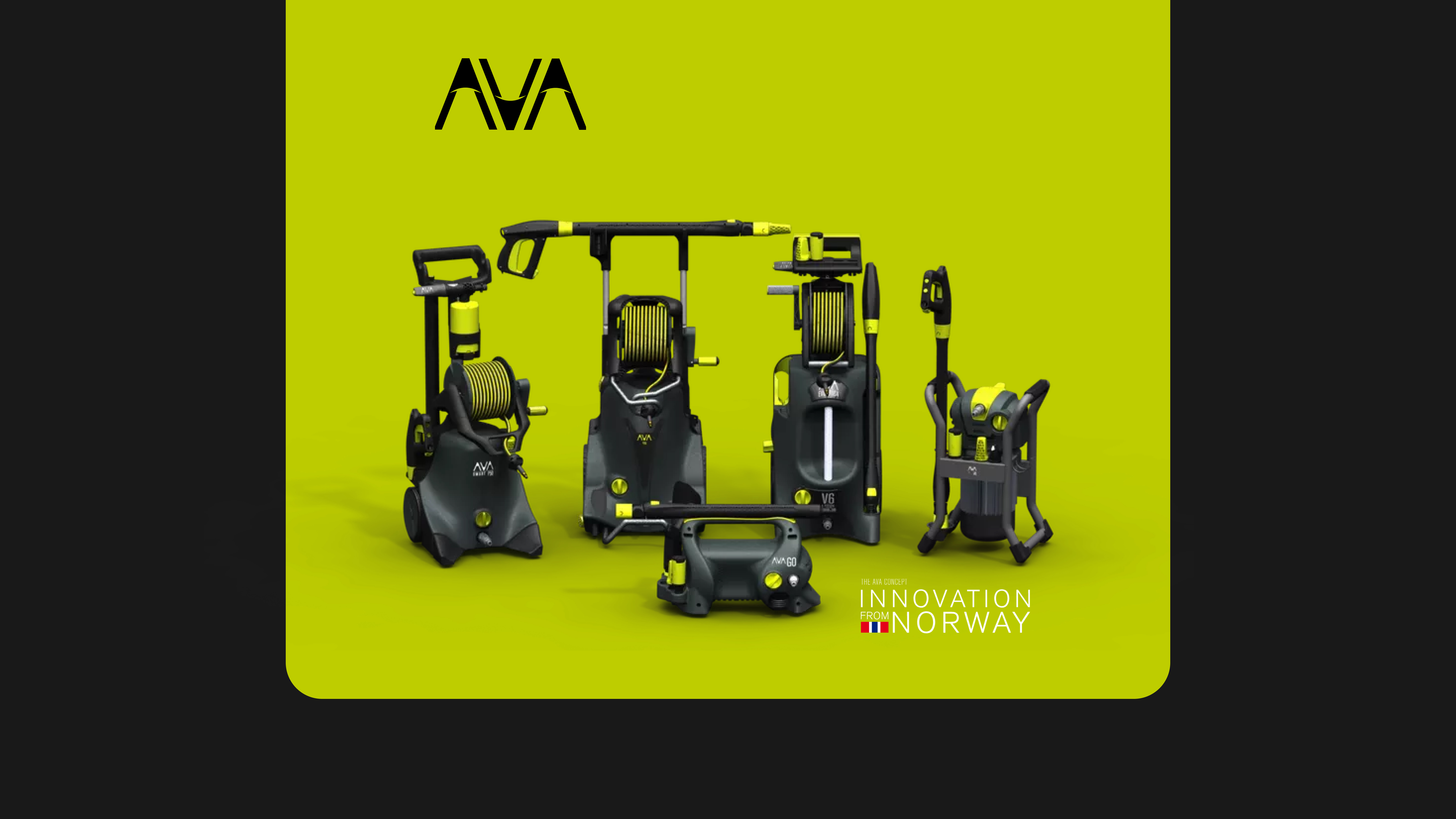
AVA of Norway
AVA of Norway Google Ads Success