6 months ago our design team decided to start providing free UX/UI audit services for our future clients. This came up as an idea to improve UX knowledge inside the team and also as a way to show our future clients how a small, free audit can already provide them with a lot of insights on how to improve the user experience on their website.
Our UX/UI audit included a review of the website and its functionality using 10 Usability heuristics from the Nielsen & Norman group and our own in-house expertise. Based on this analysis we were able to find critical interface flaws that cause the business to lose money and develop recommendations for how this error can be fixed to improve the website’s usability.
Today, after doing more than 20 audits for different businesses from e-commerce to insurance and investment, we concluded that problems are always the same. Here are the 6 most common ones you should be aware of when developing your product.
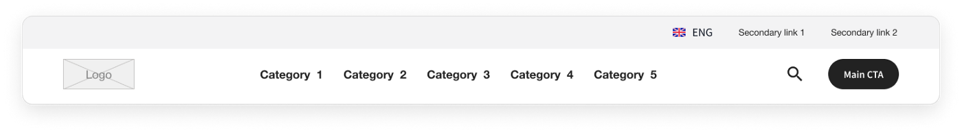
#1 Navigation
Hidden navigation is the most widespread problem when we talk about navigation on the website. When a user is entering the website his task is to find a product as quickly as possible, rarely a user is on the website just to browse the whole catalog. So you can help your user by showing the main categories straight away in the navigation bar.
By doing this:
- You give your user a quick overview of the products available on your website;
- You also make these categories visible on any page of the website and your user can switch between them fast & easily.
#2 Search behavior
Search probably is the most complex element that is available on the website. It is difficult to just build it right and even more difficult to make it helpful for a user. The behavior of search is different on websites, sometimes it’s hidden and sometimes not, sometimes it’s a typeahead and sometimes it filters the page straight away. So users need to be aware and ready for all these behaviors.
But maybe making the search just basic and simple is the best choice to accommodate all users?
- Search should be able to help the user by identifying what the user needs before the user has typed it. Show the user some options when he has just opened a search bar. You can show a couple of your most popular products or just the main product categories. It’s a way for you to navigate your user into the desired flow.
- Typeahead & autocorrect features in search are probably the most important things any website should implement. All people make mistakes, unfortunately, we can not keep everything in our memory. So the task of the search field is to point me in the right direction.
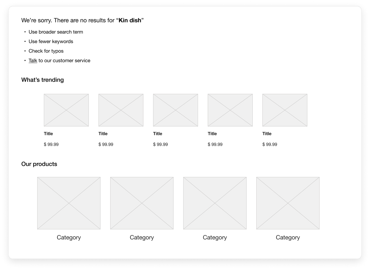
- Don’t show an empty “No results” page, instead, help the user to move forward. You can show links to the main sections of the website or the most popular products, just don’t make this a dead end.
We have seen that the search feature is deprioritized on some websites, which can be a wrong decision. Yes, not all websites search is the first choice for a user, but on e-commerce, you can see in data how huge is the amount of users that use search and how much higher is their conversion rate when compared to users who do not use search.
Search is also a great tool to help you analyze your users’ behavior. Such as, what products they search for — maybe there are some brands you should add to your offering. So, implement search, implement it correctly and analyze constantly.
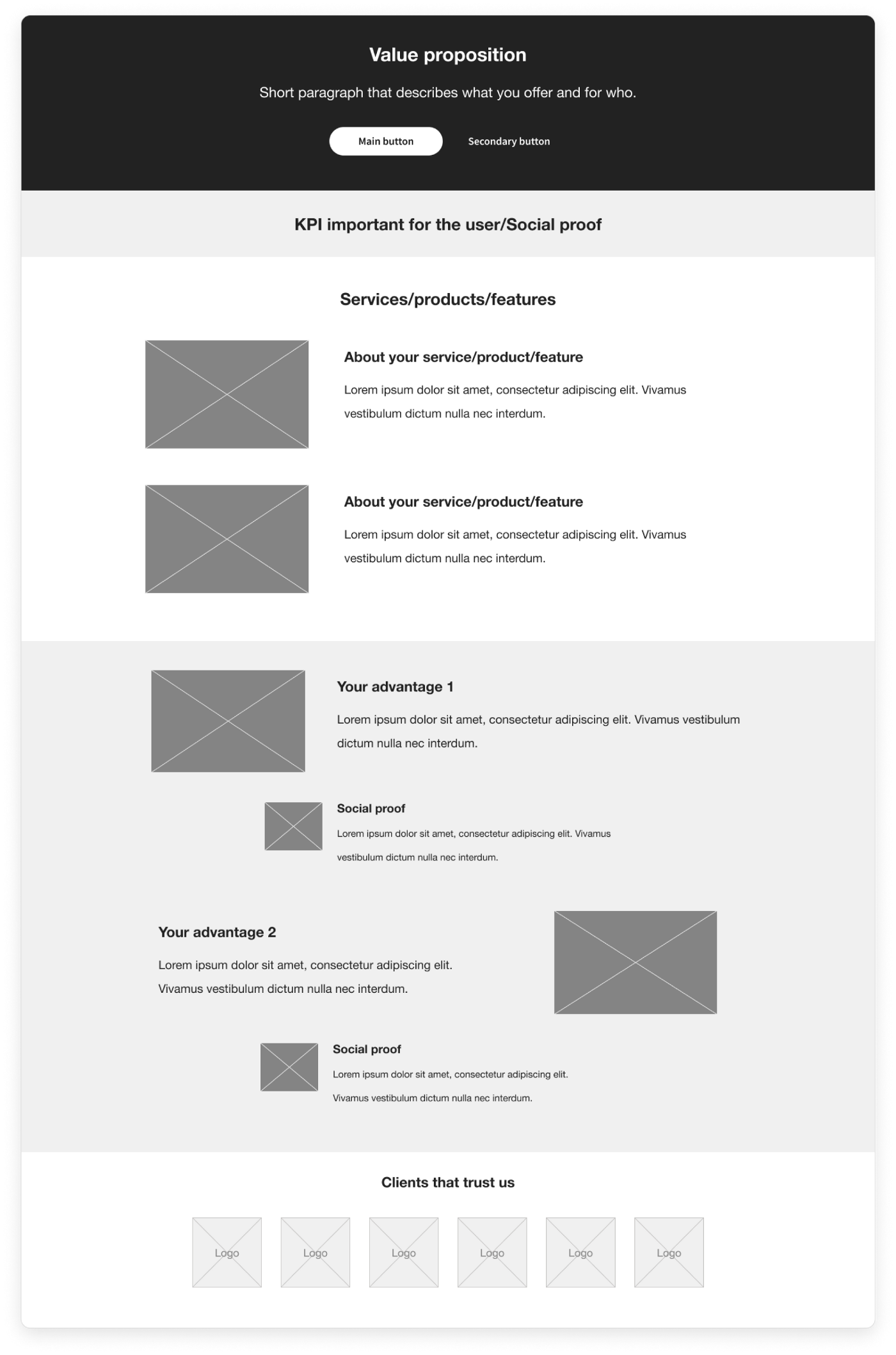
#3 Homepage information architecture
In the majority of flows, the homepage is the first page your user will see when he gets to your website and the biggest flaw we have seen in almost 90% of the pages is the content and the way it is structured. Your homepage can have different types of visitors, so the content and its placement should be suitable for all 3 types:
- It can be a user who knows your company;
- It can be a user who knows he has a problem and is looking for some solution;
- It can even be a user who is not aware of the problem at all.
The homepage page has several main objectives:
- To give users high-level information about the product;
- Provide navigation toward additional information;
- Present users with a logical call to action that will lead them further in the funnel.
So the best things to show on your homepage to engage your user are answers to these questions:
- What is this product/service about?
- What can I do here?
- How is it useful to me?
- Why should I buy from you instead of the competition?
The amount of content will always differ for different types of products, so it’s not always less or more is better. For a simple product that users are aware of the amount of info will be much smaller than for a new innovative product that has never been seen before. All this information is possible to get only from talking to your users, observing them, and digging deep into analytics.
Do make sure that your homepage answers all questions that come to the user’s mind and order the content accordingly. Your homepage should tell a small story and engage users to read it till the end.
#4 Forms
Almost every website has some kind of form, from “contact us” to “register” & “checkout”. And almost all forms have the same problems.
One of the most important mistakes is the number of fields in the form. And here there are two subtypes of problems.
- Try to get over the “Greedy marketer complex” — wanting too much information about a customer for your CRM or other marketing purposes. Think about which fields are 100% necessary for you to be able to perform the action the user is submitting.
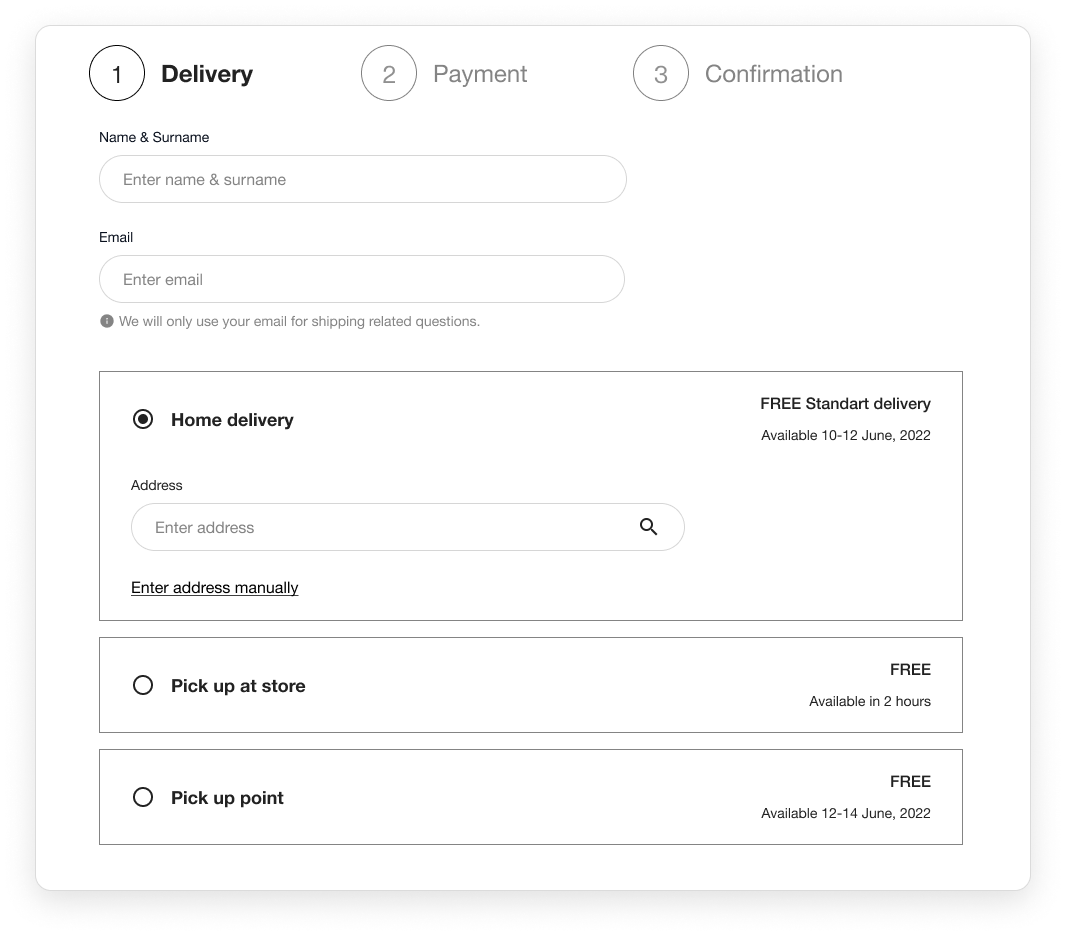
- In longer forms such as checkout sometimes it’s not so easy to just remove fields, but even here there are plenty of ways to form easier to complete:
- Break the form into steps. The idea behind multi-step forms is to reduce the perception of friction. And start with easier fields. Ask for something like a Name, or Email first. If you start with something hard — say credit card numbers — people will be less inclined to get going.
- Avoid optional fields. If you don’t need this info 100% then no need to ask for it.
- Use conditional fields that appear only when something is selected. Example: show address field only if “Home delivery” is selected.
Another mistake that often appears in forms is error validation, identification, and help in fixing. Every time people see an error message, there’s gonna be a portion of people that will drop off. So the main task is to avoid error messages and do everything so that your user would not even have this error. This can be done by:
- Giving clear instructions to the user. Clearly explain what needs to be added to the form. For example, if you ask for “Company number” and in your country its an 8-digit number, then in the placeholder you can write “Enter 8 digits company number”
- Validate fields in real-time and not when the user clicks on “Submit”. Once the user added info in the field and moved his focus you can confirm that it’s a success or tell users how to correct their entry in the most specific way possible.
But let’s be honest, errors occurred and will occur anyway, no matter how much you try. So when it does happen don’t use jargon, or technical language but just speak to your user in human language.
Use a simple formula to create a message: [what went wrong] + [what to do to fix it]
Example: “Incorrect email. Enter your email in the format: yourname@example.com”
#5 Generic consistency
Consistency, consistency, and one more time consistency. This is what is extremely important to make it easy for your user to complete any action on your website. It’s all about making elements look and behave the same, so the user does not need to learn it again & again when he browses through the website.
The most frequent mistakes are:
- Inconsistent link or button naming. Be consistent in the way you name your links & buttons across all pages.
- Inconsistent style of buttons. Whichever colour & style you use for it do it the same way on all pages. Make it clear which button is primary and which is secondary.
- Inconsistent usage of the brand’s tone of voice. Select one tone that suits your product/service and stick to it, whether it’s strict and official, funny or encouraging.
- Inconsistent page layout. Creating templates for your pages is a great way to speed up both design & development work and it will also ensure that pages are consistent.
#6 Technical issue
During all audits, we have seen plenty of websites with fancy animations that take ages to load, buttons that do not perform any action, on navigation menus that do not want to expand.
Improving the usability & design of your website is, of course, something that will differentiate you from the competitors, but the primary thing is that the website should just work. Testing and fixing technical bugs, and making website load speed as less as possible is the first and most important thing every company should do.
Final thoughts
Is an audit a solution to find all usability problems on the website? No, it is not. But it’s a good starting point for further analysis and user research. From time to time any business needs to have a new and fresh perspective on things whether your product is in the initial stage or ready and functioning. A UX audit done by an external team of experts can not only show you all the main places where you may lose your users but also make your website more personalized, client-oriented, and user-friendly, which will eventually increase conversion and sales.
Get in touch with us and find out how TRY can help you improve the user experience on your website!
Good usability = Happy user
Happy user = Returning user
Returning user = More revenue